Previously in ‘The concepts that didn’t make it’ we looked at the Alecto Recruitment leader board designs, which if you haven’t already seen we highly recommend checking out, just click here. In this blog we’re looking at the ones that didn’t make it, specifically relating to specialist recruitment company Stride’s new logo and branding. Stride operates in the niche Infrastructure, Design, Engineering and Construction sub-markets and is part of the international company STR Group.
Our designers were initially supplied a brief during the first client meeting of producing a logo which was cool, edgy and stood out from the competitors. They were particularly keen to see concepts which featured a word mark logo. This is defined as a distinct text-only typographic treatment of the name of a company, institution, or product name used for purposes of identification and branding. Stride wanted new branding which reflected the light hearted, energetic and chatty personality of their company. Due to Stride’s specialism being in the architectural industry, they emphasised the need to appeal to a creative market of candidates. They really wanted to push the boundaries and advised us not to be scared to take risks. So that is what we did!
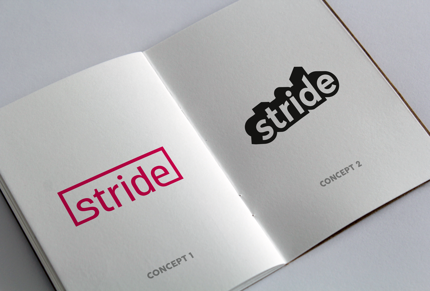
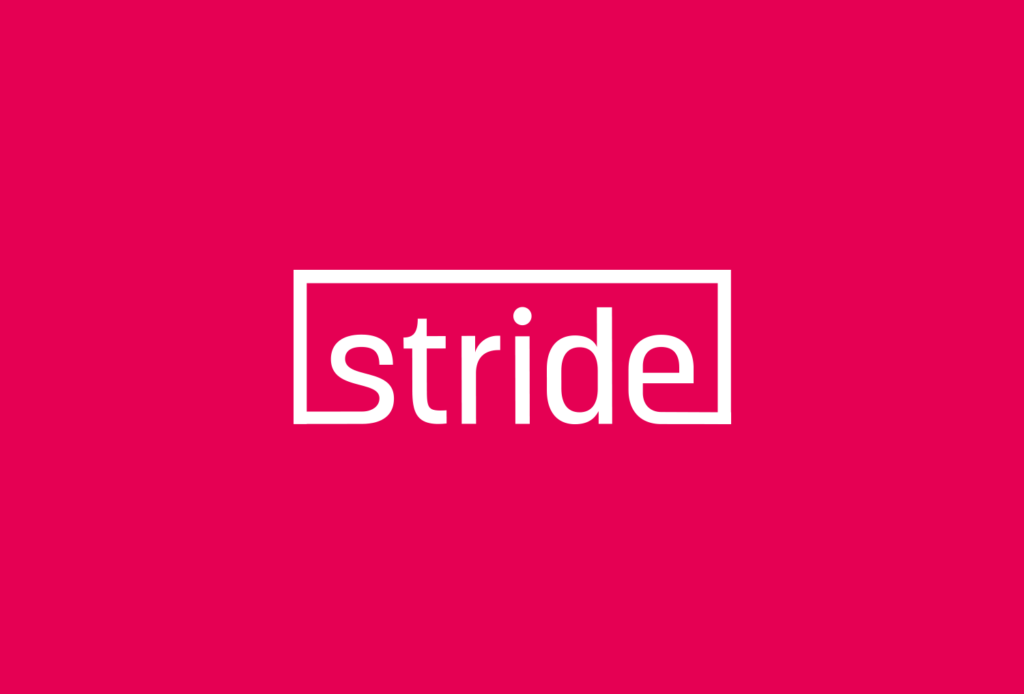
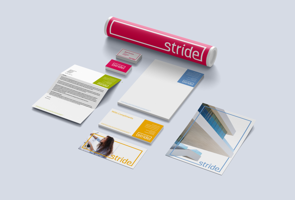
The logo below is the first concept we proposed to Stride. It is a wordmark logo, which is embellished by an integrated frame. The frame is a consistent design feature which can be adapted to any size deliverable, creating a strong brand identity. The logo being within a rectangle gives the appearance that it is part of a structure, which is solid and stable, subtly relating the design back to the infrastructure market. A bold, bright colour choice of pink was used to make Stride stand out from competitors and to give the brand a fun and creative identity. Despite pink being the primary brand colour, it was proposed that other bright colours within the secondary palette could also be used for the logo on stationery designs.
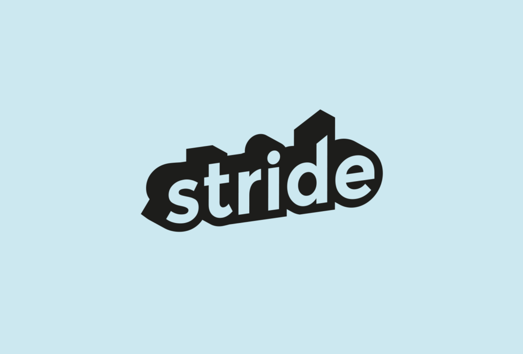
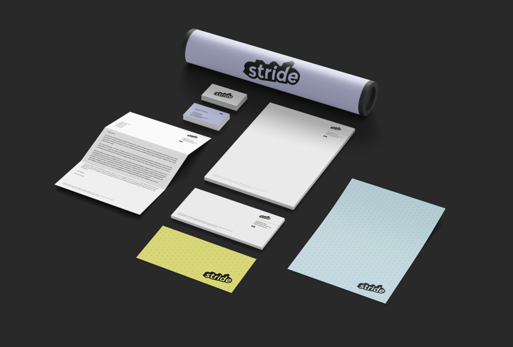
The second concept has also drawn inspiration from the client’s specialist sector of architecture. The ascenders of the letters in the wordmark are used to build the suggestion of a skyline (a clever design feature we think). The logo really packs a punch with the use of a dramatic outline suggesting a 3D element, which creates an urban and trendy vibe. The typography has a mixture of curved and straight edges to mimic angles used within the built environment. The slanted angle of the logo adds depth and implies perspective, again another subtle link to the market. The logo is dynamic and really projects a sense of approachability and friendliness. This is achieved through the rounded lowercase sans-serif typeface along with the pastel colour palette, which was suggested to use for stationery designs and web styling.
If you have been keeping up Glow, you may have seen one of our most recent blog posts on Stride’s new brand. And for this brand, instead of our normal two concepts, we went all out and produced four. Stride and Glow revisited the brief and sense checked the market, the needs and style: upmarket and contemporary. With concept three and four we moved away from a being youthful and bold feel to a more professional, minimalistic style. This was turning into an exciting brand and the creative process invigorating.
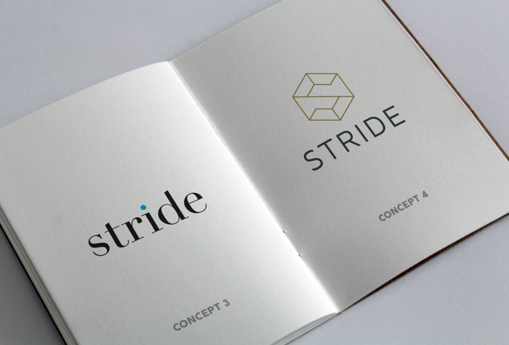
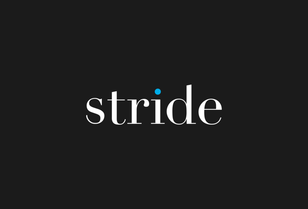
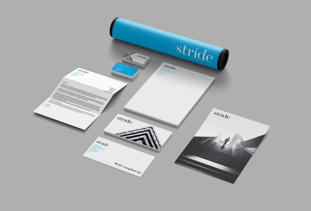
Concept number three stuck to a wordmark logo, to work stand-alone, which is a powerful statement. It implies the brand is well established and can stand its ground within the market place. In our mock-ups we show the logo in lower-case and using a distinctive serif typeface. This provides the brand with a timeless, high-end feel and also ensures that it would stand out from Stride’s competitors. The choice of serif font creates a horizontal line across the bottom of the wordmark, alluding to strong foundations and structures; an ideal link to the architectural market. A black primary colour was chosen as it is contemporary and professional, this was then paired with a vibrant blue to create a strong contrast and too add a colour pop.
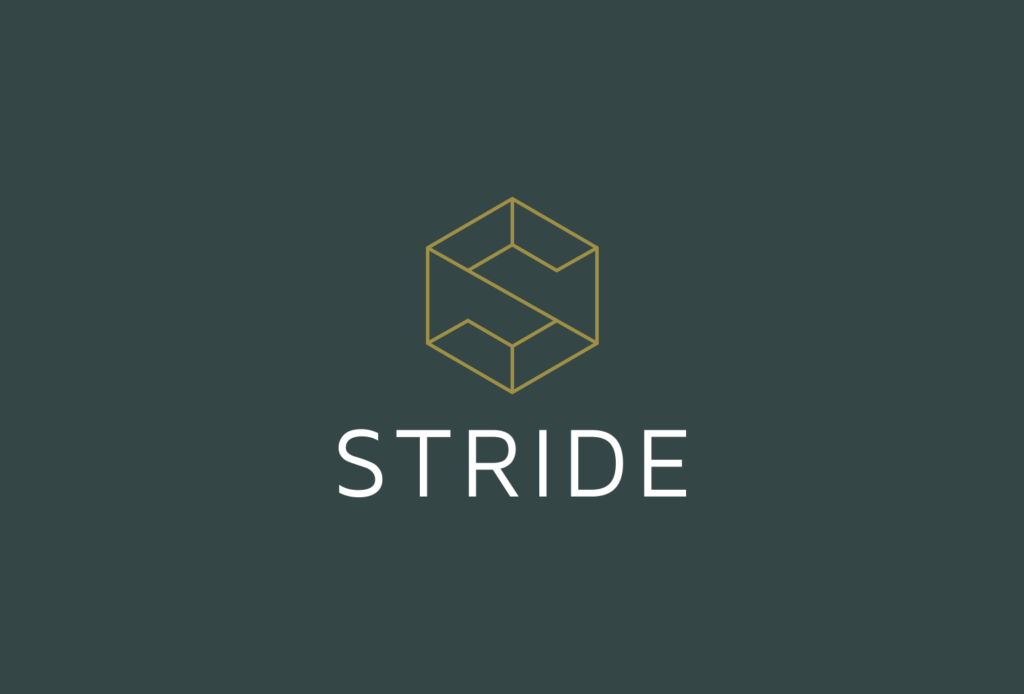
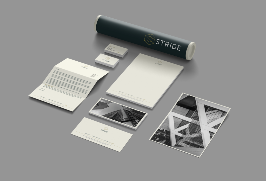
In contrast to the preceding concepts for number four we wanted to provide a solution which featured an icon within the logo. This concept plays with the idea of perspective and illusion, whilst also forming a clever link to architecture and blueprints through the use of a wireframe cube. The letter ‘S’ is also subtly hidden within the custom icon, reinforcing the brand identity. An upper-case sans-serif font was combined with the logo, as it simple, clean and reflects styling used within London-based architectural agencies. It also ensured legibility and offers a modern feel to the brand. A gold and charcoal colour palette was suggested, as this colour combination creates a real sense of opulence and class; a perfect way to present Stride as a market leader in the architectural recruitment field.
The team at Stride were delighted with the concepts and felt that they really encompassed all of the elements they had envisioned of the new brand. So, this make picking one a pretty hard decision. The fourth concept (the icon-based logo) was the one they particularly fell in love with and decided to take forward. With a few tweaks to the typography choice and slight adjustment to the stationery layouts Stride’s new brand was born!
Check out Stride’s new website to see how the brand has been implemented using the comprehensive brand guidelines we also created for them.
Take a look below to see a comparison of all four concepts! It’s really interesting to see how our designers apply different creative techniques when interpreting the brief and use their individual styling to influence the concept, resulting in two unique designs each time.
